The Best Paint Color for Your Media Room: Set the Mood
Choosing the *right paint color* for your media room can truly affect the whole vibe. If it’s too bright, it might steal the spotlight from your screen. There’s a whole spectrum of colors out there, many specifically marketed for media rooms. Dive in with me, and let’s nail down the perfect hue for your space!
The best paint color for a media room is black because it doesn’t reflect and brighten the room as much as light colors. You could also opt for dark brown, dark green, burgundy, and similar dark colors. The paint behind your viewing screen should contrast the room, so consider dark grey.

Throughout this post, I’ll help you choose the best paint color for your media room and which colors you should avoid. Let’s get started!
Also read: 5 Best Wall Colors For Your Home Theater
As an affiliate, I may collect a share of sales or other compensation from the links on this page.
Choosing the Best Paint Color for your Media Room
When choosing the right paint color for a media room, you should consider color, shade, and reflectiveness. You should also think about how the color will interact with brightness coming through the windows or from the viewing screen.
Let’s break down each of these concerns below:
- Stick to traditional movie theater colors. Grey, dark brown, and burgundy are three of the best colors to get the most out of your media room. Not only will it prevent people from seeing the wall paint out of the corner of their eyes, but it’ll also highlight the screen.
- Find a darker shade to prevent distractions. Bright, light paint can be distracting because it makes it difficult to focus on the screen. Additionally, bright colors and shades can reflect the colors throughout the room. You’ll see glares to your bright and left, drastically reducing the viewing experience.
- Make sure the paint isn’t reflective (and consider matte paint). Reflective paint is often used in homes with overcast climates to make the room look brighter and lighter. Regular house paint isn’t too reflective. That said, I recommend going for matte shades since they limit the previously mentioned glares and reflections that could hinder your media room’s effectiveness.
- Paint the media room to match the room’s brightness. For example, media rooms with several windows need matte grey or burgundy to balance the sunlight. On the other hand, media rooms without too many windows could stick with black or dark brown. You should also remember that the floor color should be dark to prevent window reflections.
- Choose a paint color that separates the room from the rest of your house. Your media room should feel like you’re walking into a private theater, not just another room in your home. If the rest of your house is grey, go with dark brown (or another color mentioned above). Make sure the media room’s paint color is a strong contrast.
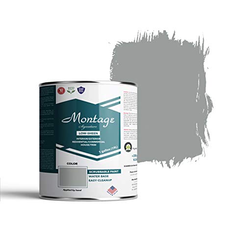
If you’re looking for media room paint, try the Montage Signature Interior Paint (available on Amazon.com). This low-sheen paint comes in numerous colors, including several shades of brown and grey (see image below).
It doesn’t require primer, so you don’t have to worry about applying multiple coats. Furthermore, it’s eco-friendly and dries quickly.
What Paint Colors To Avoid for a Media Room
You should avoid paint colors that are bright, reflective, glittery, or overly textured. These paint types are often distracting, making the media room feel more like a regular living room or a kid’s room. Stick to darker, matte shades for the best results.
Here’s an in-depth look at what you should avoid when choosing media room paint:
- According to Elite HTS, you should avoid paints with ‘semi-gloss,’ ‘gloss,’ or ‘satin’ in the description. All of these shades are too reflective, and they’ll bring down the value of the paint you chose. For example, high-gloss black paint will reflect everything, making the room extremely bright.
- Stay away from bright colors, such as yellow, sky blue, or pink. These colors won’t let the room get dark enough, especially during bright scenes on the shows, movies, and other media you’re viewing. Instead, stick with dark earth tones for the best results (or burgundy and matte black).
- Glitter is a no-go for media rooms because it’s too distracting. Many people use glitter and other paint additives to highlight the room, but it reflects light the second the screen turns on. Furthermore, it doesn’t make the room feel nearly as immersive as it should for a media room.
- Textured paint is okay, but make sure it’s not too textured. A little texture is acceptable because it can absorb bright colors from the viewing screen. However, overly textured paint and painting techniques reflect light toward the screen, making the media room look a bit brighter.
Should a Media Room Be Dark?
A media room should be dark to highlight the viewing screen. Additionally, dark, matte colors often prevent monitor reflections that can pull viewers away from the screen. Consider basing your media room’s dark color scheme thematically.
In fact, Sure Pro Painting shows darkness is one of the most important attributes of selecting media room paint. Remember, the shade and style of painting are equally important.
So, does this mean you can’t use white paint in your media room? Not quite.
You’ve likely seen plenty of media rooms and movie theaters with white walls. This is because they use eggshell matte white rather than bright white. Using bright white will reflect everything, as mentioned above. However, matte eggshell white gives the appearance of a white room without unwanted reflections.
Note: If you want to base your media room on a theme, choose matte shades of each of those colors. For example, blue and red might be too reflective, but matte blue and matte red are much more forgiving for media room brightness.
Final Thoughts
Making your media room dark will help everyone view the screen much easier. Viewers can immerse themselves in the experience by reducing the reflections and brightness.
Once you choose the paint color, you can find the best home theater chairs to match the setup. Consider similar colors, such as burgundy, dark red, black, and dark brown.